DesignUI/UXSoftware
Scan and Go - supermarket self-checkout app
Case study: Designing a mobile self-checkout experience for Walmart to streamline shopping, reduce queues, and explore future retail innovations
By jinesh
3 min read
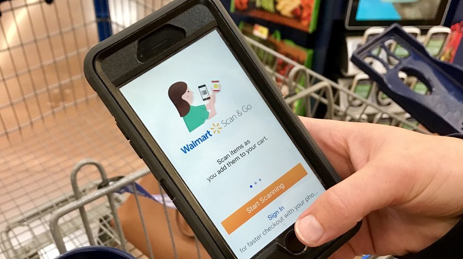
Supermarket Queues Have OFFICIALLY Been Ranked From Longest To Shortest!
This headline underlines a significant consumer pain point: the frustration with long checkout queues. Studies have consistently shown that shoppers tend to avoid supermarkets with lengthy checkout times. Even self-checkout kiosks, while intended to alleviate this issue, haven't quite hit the mark in terms of consumer satisfaction. This presents a clear opportunity for innovation in the shopping experience.
Introduction
In today’s fast-paced world, time is of the essence. The traditional supermarket checkout process, characterized by long lines and slow-moving queues, has become a major inconvenience for shoppers. This UX exercise is to enable shoppers to self-checkout using their smartphones. It was done as a design challenge for my Walmart interview. There were a bunch of assumptions made keeping the future in mind, like how the tech is going to evolve.
Understanding the Problem
I went on to Yelp to look at the customer feedback on various supermarket establishments.
Insights
- People hate queueing in front of the checkout counter and wasting time
- Most people hate the attitude of the cashiers
- People hate bad interaction with the staff
Self-checkout vs traditional checkout
NCR invented the self-checkout a hundred years ago. Simply put self-checkout avoids your interaction with a cashier, instead you do the billing yourself. A novice shopper without much knowledge about how the system works again delays the process.
Deterrents
- The fear of making mistakes at self-checkout counters
- The working-for-free mentality is strong: most people feel they are working for free
How Scan and Go technology changed shopping in supermarkets
Early deployments of Scan and Go technology require shoppers to carry a handheld scanner around the store with them. Instead of going through the lengthy process of scanning items at the end of the visit, customers can scan each item as they put it in their cart. This allows them to pack while they shop and arrive at the checkout with a pre-scanned list of items, both of which accelerate the payment process.
Why carry an additional scanning device when users have a powerful computer in their pockets? Also, storing and maintaining the scanners in the store is a big task
Benefits of moving to mobile
With mobile, retailers can push targeted offers and promotions directly to the consumer as they shop. For repeat customers, merchants can collect user behavior and purchase patterns to promote recommended products and remind consumers to pick up their frequently bought items.
User Personas

Name: Sarah
Age: 24
Occupation: Financial analyst
My #1 go-to place for food shopping is my local Whole Foods
Among these users Christine is my hero user, she is the power shopper.
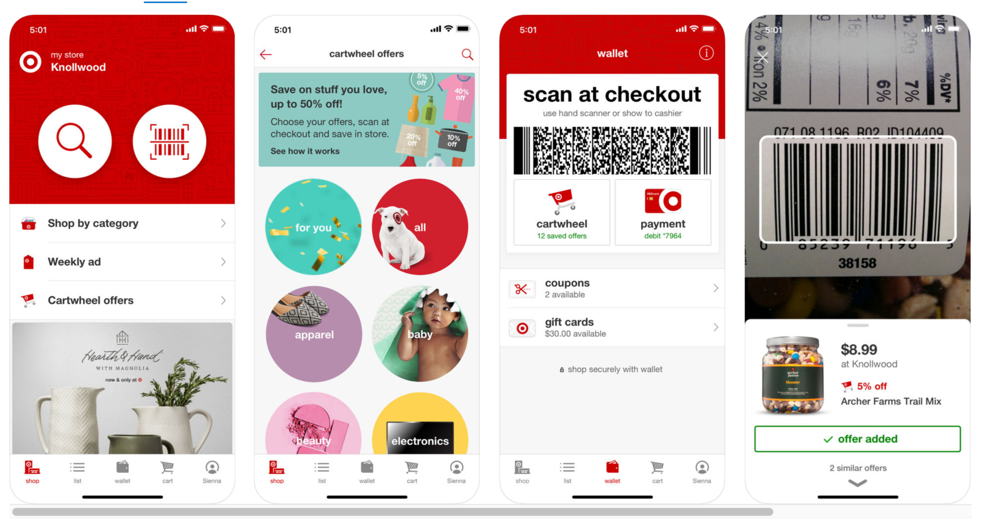
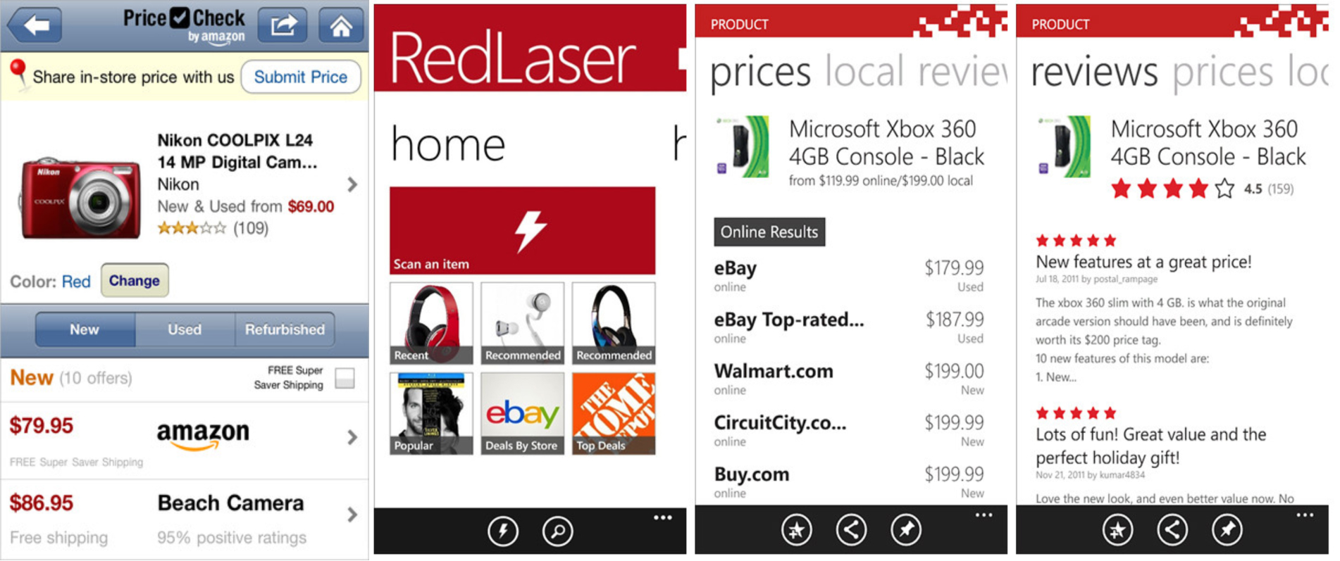
Apps serving similar purpose
Initial iteration and wireframes


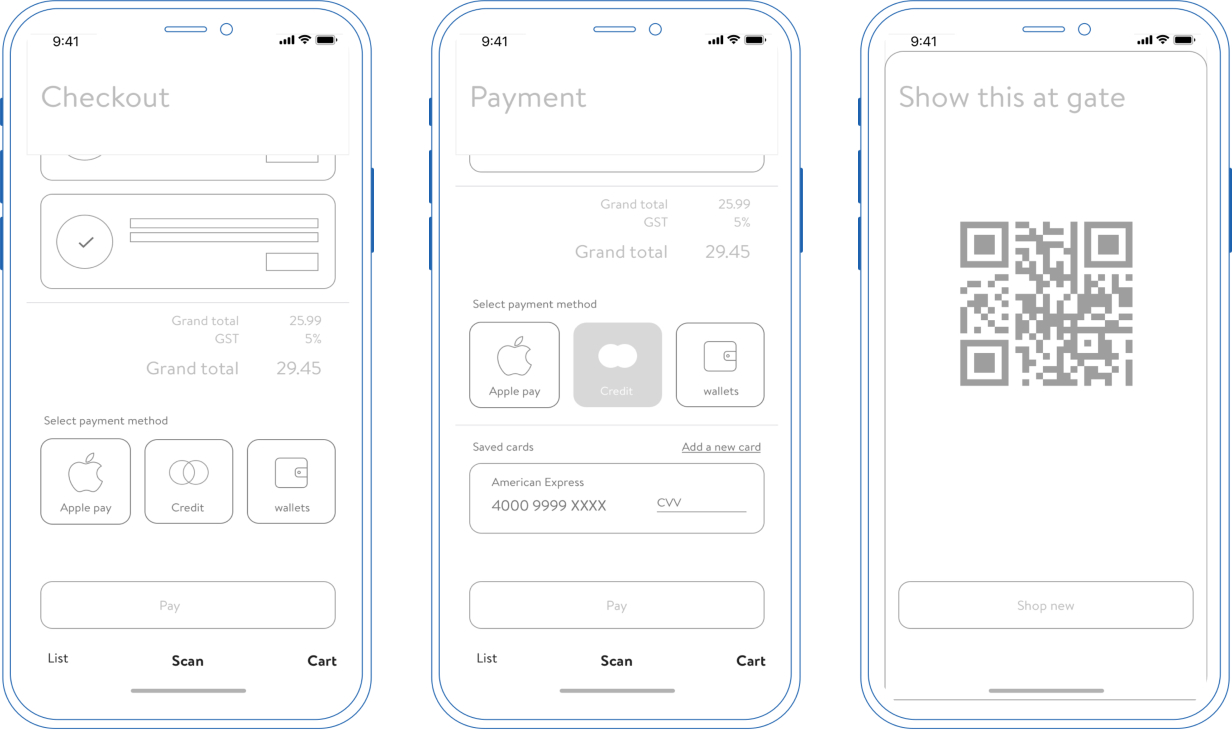
I chose to follow the iOS 11 and iPhone X design standards and Walmart color palette for the app. Usability being the main theme, I focused on how the app can be used with one hand. The three main screens
- Shopping list
- Scan screen
- Cart
can be accessed by swiping left or right. The app always lands on the scan screen, unless it's the first-time login.
Final User experience
Onboarding
Shopping list before heading to the store
At the store
Payment and faster checkout
Conclusion
The self-checkout app project demonstrates how user-centered design and technology can transform the shopping experience. This was the design challenge that got me through the UX designer interview at Walmart.